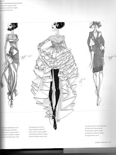
This is my interpretation of one of Cassandra Rhodin's illustrations. It has been based on some of the illustrations that I drew last year, in second year.
Cassandra Rhodin's figures don't have any skin tone, instead they have a greyish tone. I didn't like the grey tinge so, for this illustration, I have left it white and focused attention on the outfit instead. The image below shows the templates that I used in second year for my drawings. I traced over the one on the right and applied it to Cassandra Rhodin's figure in order to create my own interpretation
I also drew some inspiration from the pictures shown in the previous post, which came from Company magazine.


